A trend that’s been around for some time but has recently become one of the most discussed trends in web and user interface, thanks to its adoption by the likes of Microsoft, Apple and Google, is flat design.
But what is flat design? Where did it originate? And what’s its potential staying power like?
Flat Design: The Basics
Flat design is the sophisticated, versatile, digital cousin of minimalism. It’s the polar opposite of skeuomorphism, where details and ornamentation are used to make the objects on your screen look realistic.
Flat design has stripped away the gradients, textures, shadows and other trickery in favour of clean, open spaces, crisp edges, bright colours and 2-dimensional illustrations. It’s a crisp, modern approach that puts the focus on the content and message you are trying to portray.

The digital landscape has become a busy, cluttered space in recent years, and flat design uses simple design elements to cut through the clutter and stand out. Its basic characteristics are simple design and user interface elements, a focus on typography and colour, no added effects, and an overall minimalistic approach – anything that doesn’t have a functional purpose is removed.
Origins & Emergence in the Digital World
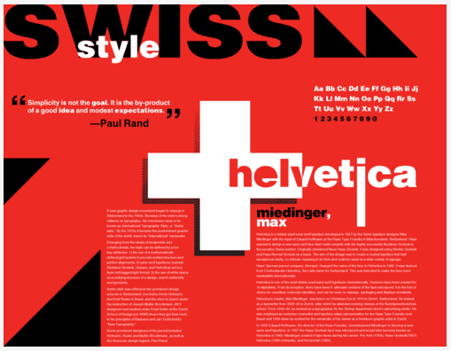
Like many things, flat design has its origins in the history of art and print. The Swiss style of design, often called the International Typographic style, was a driving force in the 1940s and 1950s, emphasising clean lines, minimalism and organisation of content above everything else.
It also borrows heavily from minimalism, a trend that spans many different mediums including architecture, art and design. Minimalists were engaged in removing all unnecessary elements leaving only what was essential. The result was bright colours, geometric shapes and clear, crisp lines.
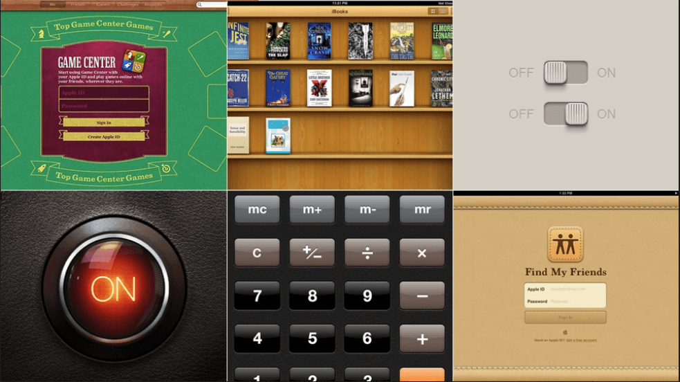
In digital terms, flat design can be traced back to Microsoft’s unsuccessful attempt to oust iTunes from the market – the Zune media player. While Zune was a commercial flop, its design – minimalistic with a focus on light and typography, and an absence of surplus details – was the start of the flat digital revolution.
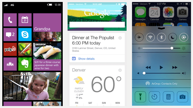
Microsoft built on this foundation for the Windows 7 Phone with its Metro design, which embraced large, bright grids, sans-serif typography and flat icons. Due to its increasing popularity, it was introduced into the Windows 8 operating system and other Microsoft products, such as the Xbox 360, although the Metro name has now been discontinued.
In 2013, flat design exploded in popularity due to its adoption in Apple’s iOS7 interface, which was a massive step away from the skeuomorphic design they previously championed. And once Apple has acknowledged a new trend, designers and developers never fail to sit up and take note.
The Benefits & Limitations of Flat Design
Flat design has many benefits to users and developers/designers alike. It’s a very honest style, with no attempt to trick the viewer with 3D effects. Instead, it embraces the limitations of a 2D screen and uses a newfound simplicity to streamline design.
There is an absence of clutter on the screen. Instead, there are simple, attention-grabbing icons and images whose meanings are quickly perceived. The overall effect is a heightened user experience with websites faster and more functional, and content that is readable and easy to navigate. People are used to technology now – they no longer require visual cues to point them in the right direction.

For developers and designers, flat design requires less development time. More importantly however, it’s scalable. With mobile internet becoming increasingly important, designers were facing a dilemma as realistic icons and other design effects are difficult to scale down, becoming cluttered and puzzling to the eye. With flat design, there are no such problems – icons and other design elements are created from bold colours, simple typography and striking 2D images, making them adaptable to any size screen.
The only major flaw to flat design is that many of the visual clues that show users which elements are interactive are missing, leaving them to rely on other cues. In a world where people increasingly skim pages this can be a problem. Done badly, it can be unforgiving, but a good designer can denote hierarchy and highlight interactive elements within these limitations.
The Future of Flat Design
As pointed out at the start of this article, trends come and go. Often new trends are a reaction to their predecessors, as flat design is to skeuomorphism. So what does the future hold for flat design?
Some developers have already decided that flat design is passé. With its adoption by Apple & Google, it’s become mainstream, and with more and more people jumping on the bandwagon it will no longer seem as modern or cool. But is it destined to become just another fad, or does it hold the key to a new design revolution?
There’s little doubt that flat design will eventually run its course, but it has highlighted an important discussion over simplicity in design. By ridding itself of unnecessary design elements, it enjoys speedier page loading, cleaner code and is easily adaptable to a variety of screens from the largest desktop to the smallest phone. This suggests that while flat design will evolve from its current incarnation and possibly reincorporate 3D elements to help certain actions stand out, interfaces needs to remain simple, intuitive and easy to understand, so the principles of flat design may be here to stay for some time.
Is flat design a passing fad, a design revolution that’s here to stay, or will it continue to evolve into something new? Join in the discussion below.